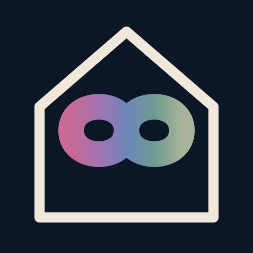
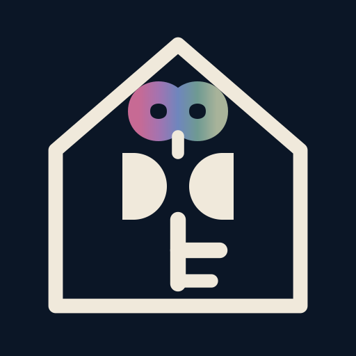
Rebuilt: the two D's now have a gap between them instead of touching, so they can't read as butterfly wings, and the key has a long shaft with a proper two-prong bit so it no longer looks like a stray mark.
1 · House and rainbow infinity
The mark for the app icon. A true crossing infinity (a middle pinch, not two wings), chunky enough that the rainbow survives at 16px. No key at this size, because a key smaller than 32px becomes a smudge.
True rainbow (red through violet)
160px
96px
64px
48px
32px
24px
16px
Dusk spectrum (skips orange, lands in cream)
160px
96px
64px
48px
32px
24px
16px
2 · The whole story, for larger sizes
Rainbow infinity as the key's ring, the two D's as separate letters with a gap between them, then a long shaft and a two-prong bit so it reads as a key. For the masthead, print and store screenshots. Below 32px the bit goes soft, so the icon uses mark 1.
True rainbow (red through violet)
160px
96px
64px
48px
32px
24px
16px
Dusk spectrum (skips orange, lands in cream)
160px
96px
64px
48px
32px
24px
16px
The brand logo · files
Dusk spectrum, no orange
The live logo uses the dusk spectrum so nothing in the brand ever reads as orange or amber. The icon is already the browser tab mark, the home-screen icon and the mark in the header; the full key is the one for print, suppliers and store screenshots.